“Scharein is a wondeful mixture: a tenacious, even obsessed, artist with an almost fanatical addiction to precision, to perfection, and at the same time an amiable, communicative person and host. The perseverance with which he works on his canvas and the friendly patience with which he explains his work to us! Thanks and respect for both!”
(Dr. h.c. Wolfgang Thierse)
Beginnings: From realism to abstraction
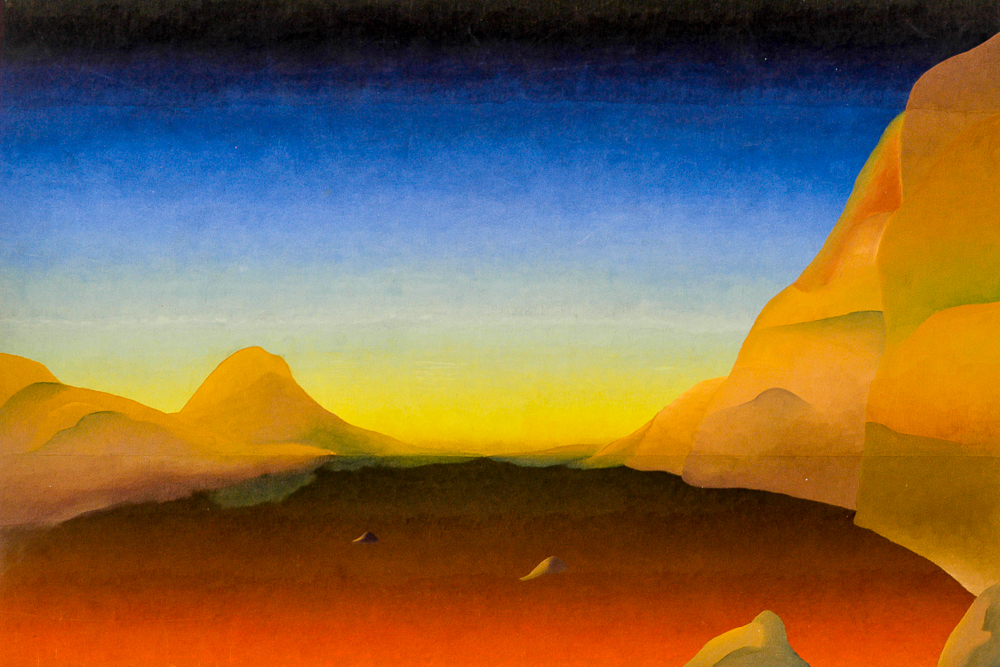
The beginning of my artistic work was marked by the examination of my personal environment, and from 1965 onwards I began to process travel impressions, especially landscapes. Soon I began to abstract them more and more.
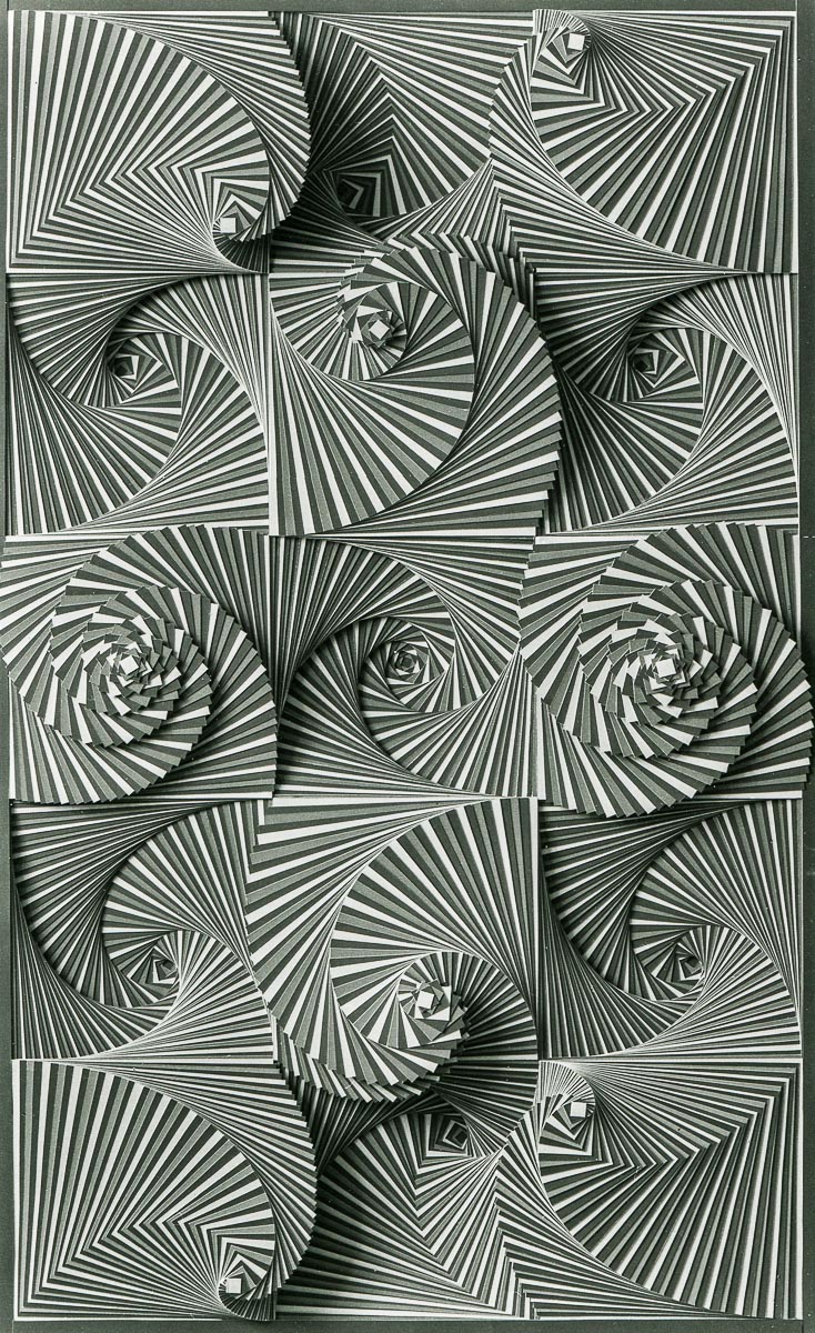
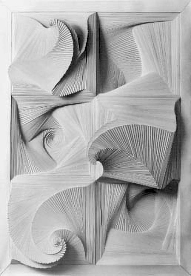
Cardboard works
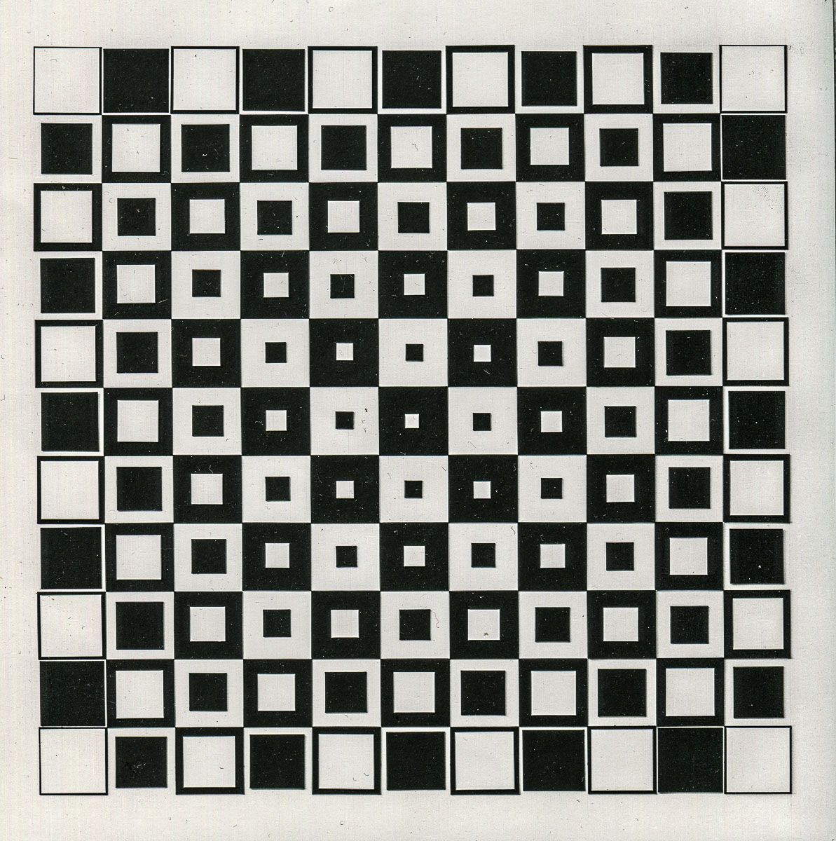
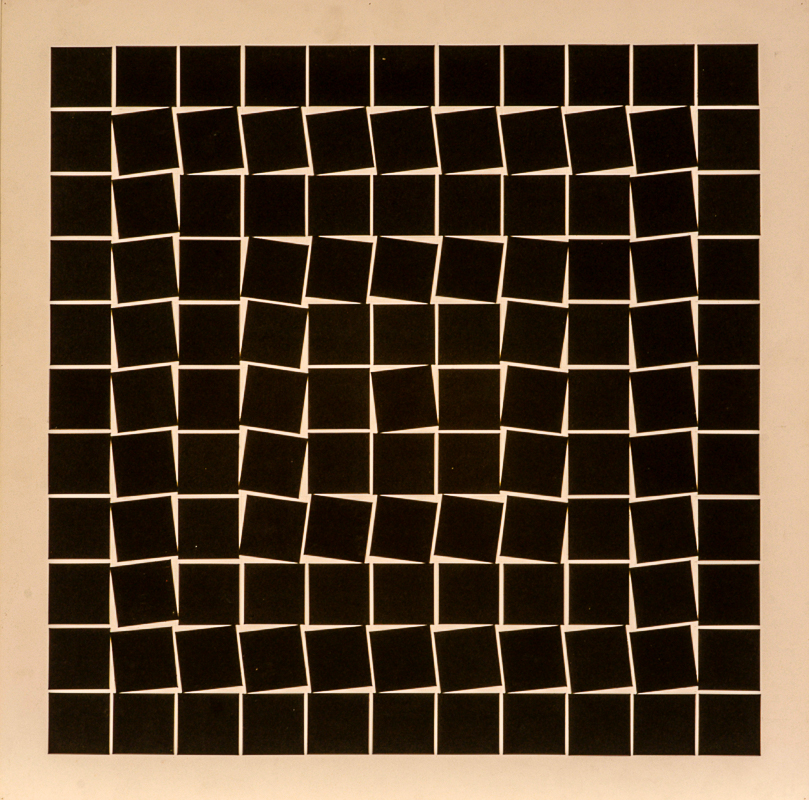
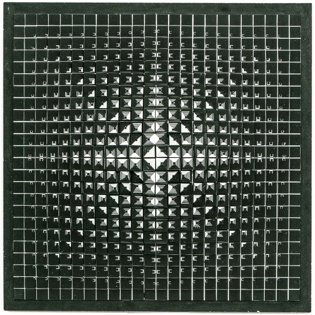
Around the age of 18/19 I decided to limit my artistic means by working exclusively with black and white and only in one basic form, the square. Between 1968 and 1974 I created two-dimensional works from cardboard, later reliefs and free sculptures.
Screenprinted
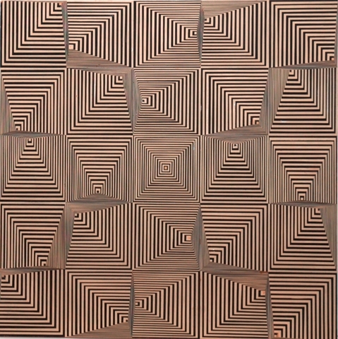
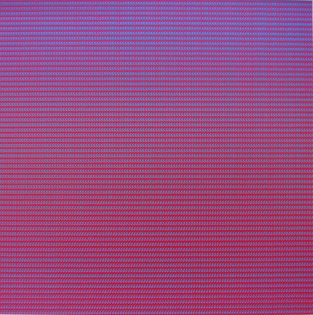
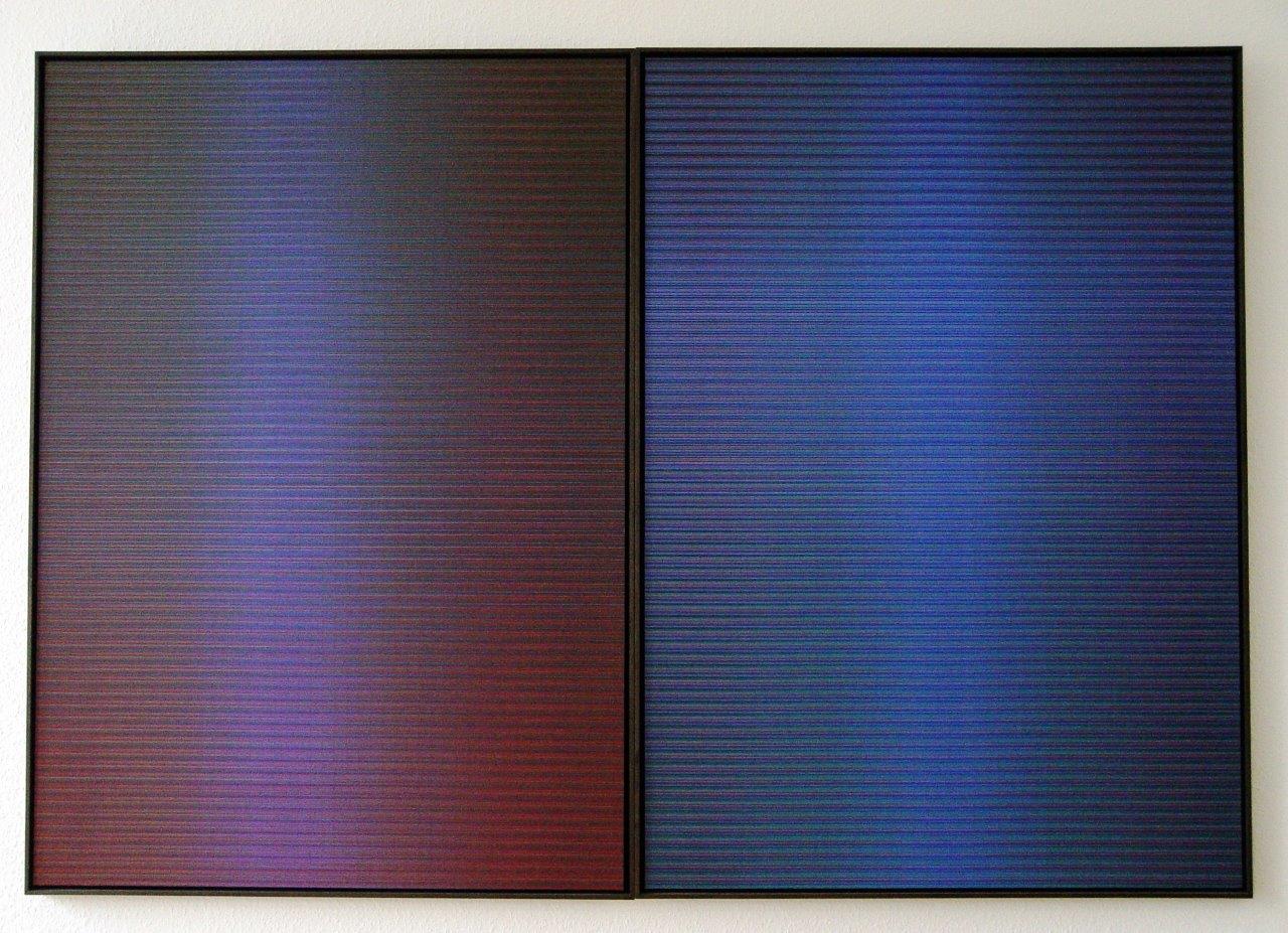
After my “black and white square time” I turned to colour. I began to convert my earlier cardboard works into coloured graphics using the screen-printing technique. In doing so, I dissolved more and more the forms and created colour surfaces from a multitude of coloured lines, next to and on top of each other. The results were my “colour-space-surfaces”, screen-printed unique pieces made of hundreds of colour tones. In the early 1980s I made the transition from screen-printing to brushwork. I took up the original structure of the screen-printed pictures.
Brushwork: Altarpieces and complementary contrast
Altarpieces
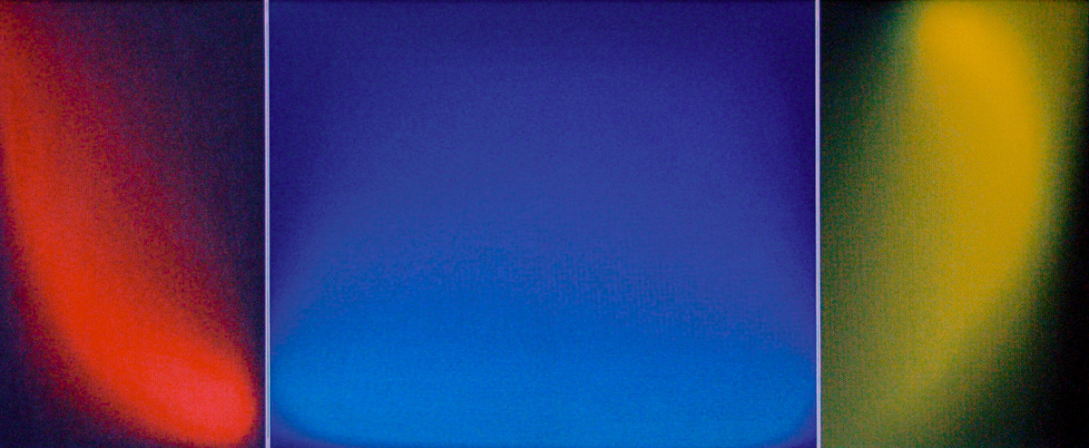
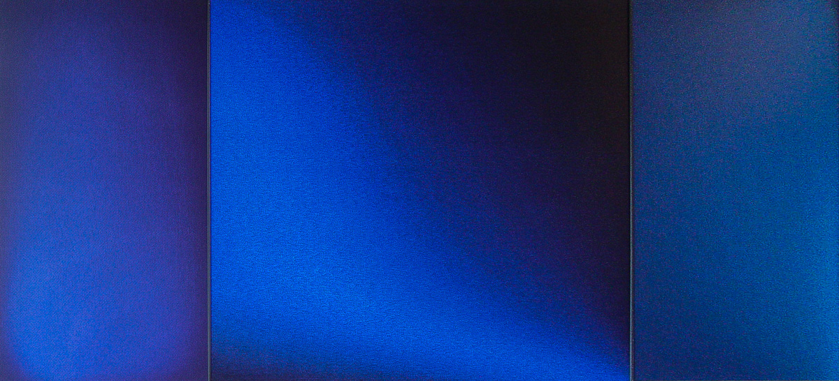
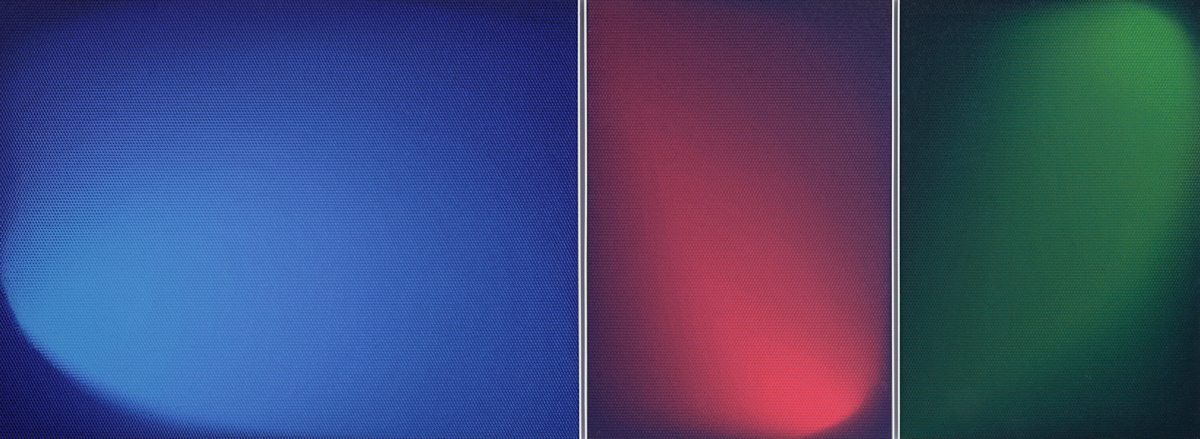
More than 40 years ago I came more and more to the basis of the triptych, the Wandelaltar, through my occupation with three-part pictures. From 1983 – 1993 I worked on the themes which for me are the three cornerstones of altarpiece painting: Annunciation, Crucifixion and Resurrection. The “Isenheim Altarpiece” (1512-1515) by Matthias Grünewald, Colmar (France) served as a great counterpart for me.
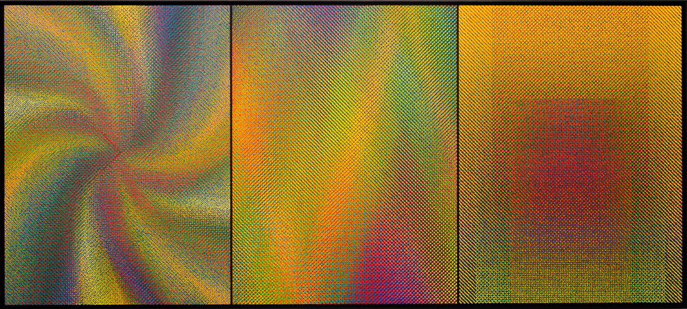
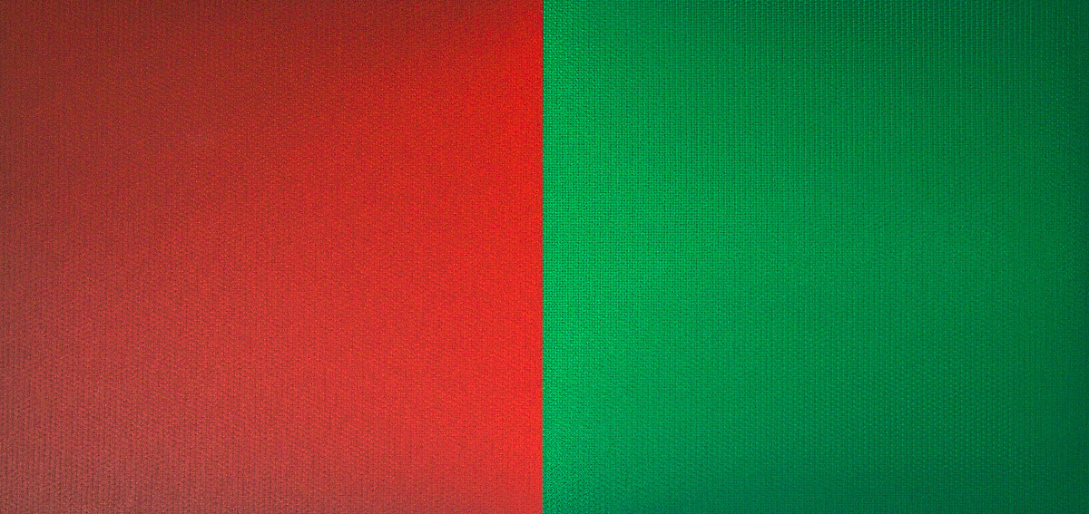
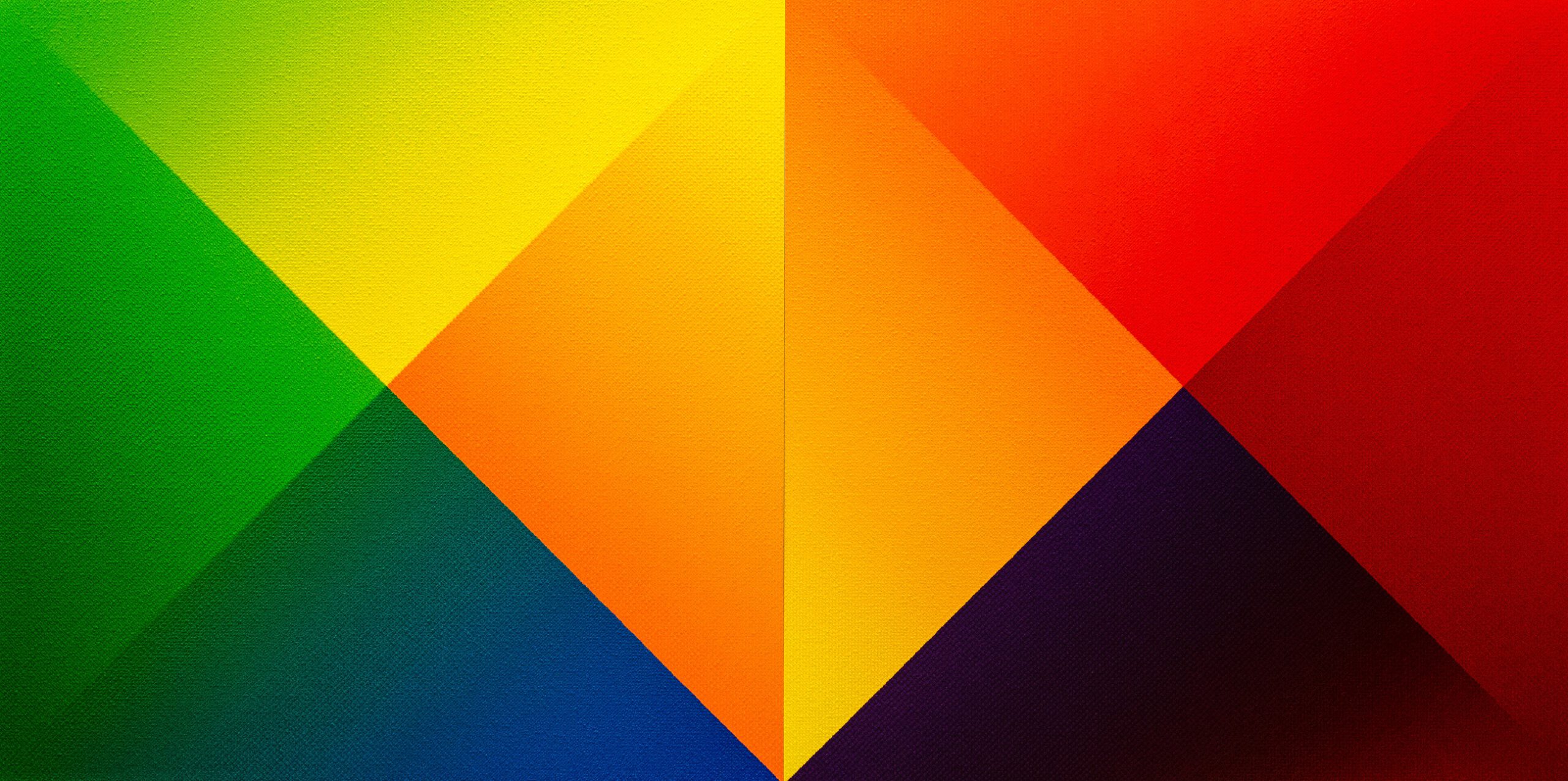
Complementary contrast
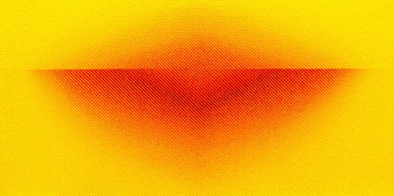
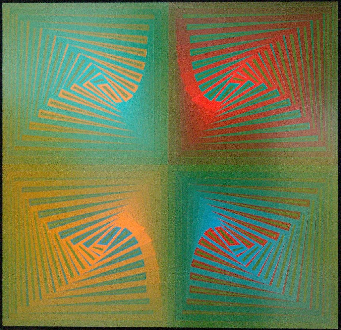
For many years, I have been fascinated by a theme in the study of colours: The complementary contrast(s), or rather the complementary contrast(s). Again and again I take up the theme of one or more of the seven contrasts in my paintings. It is surprising how many different pictures have been and are still being created. I try to enhance the respective complementary colours to the highest brilliance in order to open a dialogue with each other and with the viewers.
![]()
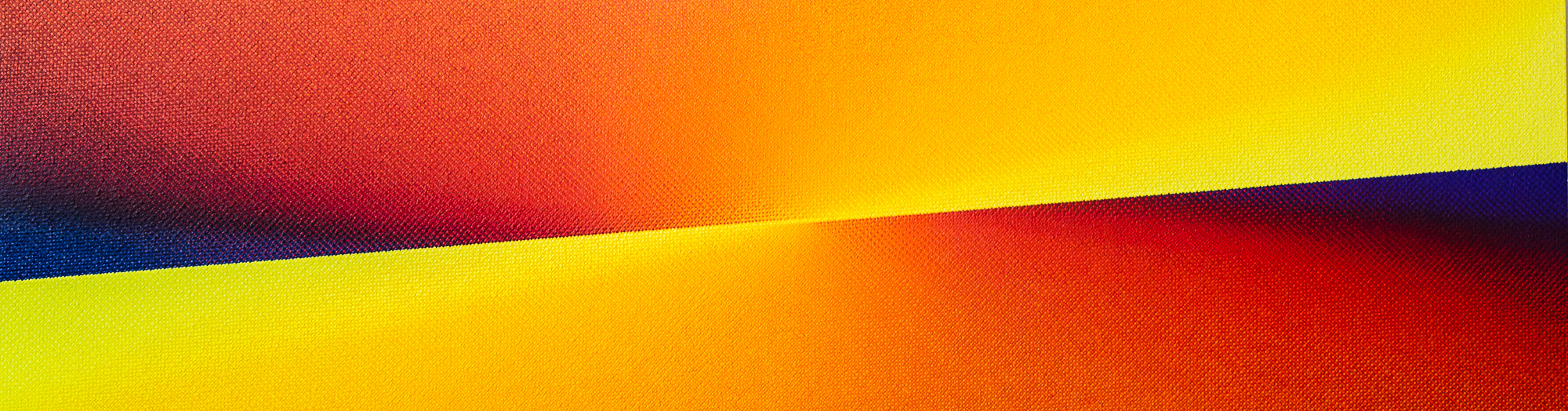
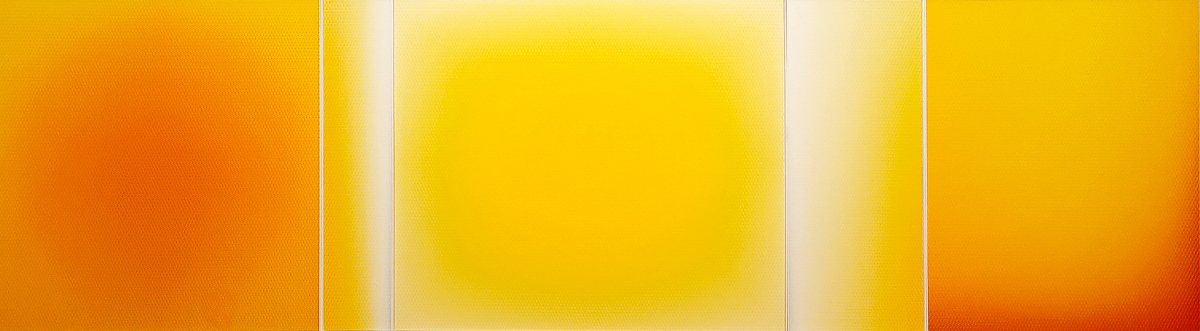
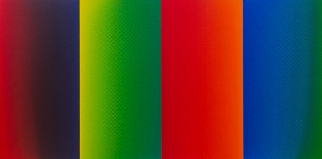
Colour spaces / free works
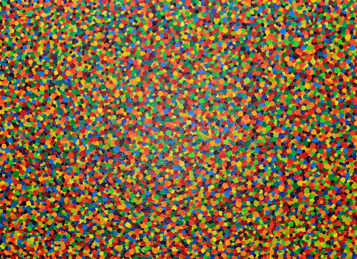
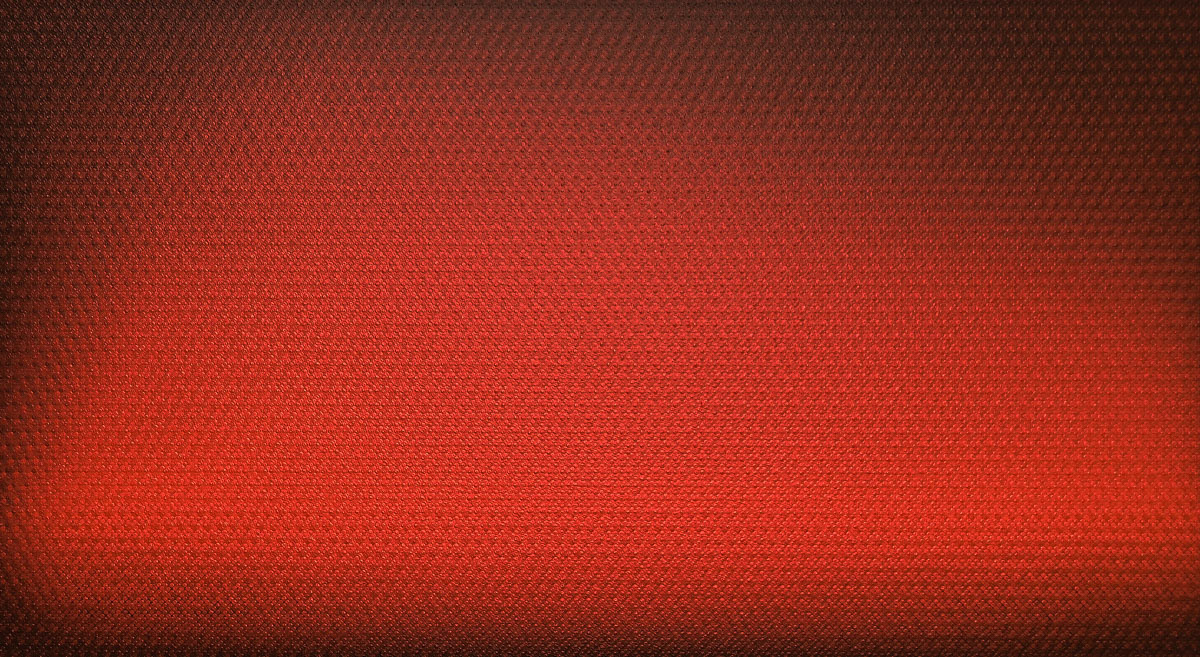
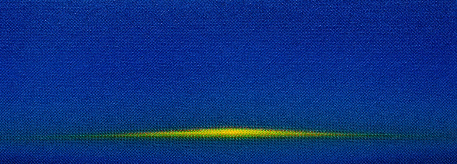
Today I have my own “signature” with the brush: the dots. Of course, there is a whole range of other themes whose realisation interests me: Exploring the big colour families yellow, red and blue; bringing colour into movement or letting colour figures emerge in the surface and also in space. But what never ceases to amaze me myself are the unexpected results of my studio work, from which new pictorial ideas keep emerging.